Tuesday, May 5, 2020

Week 14

Perry Bible Fellowship Almanak and Megg and Mogg


Gurewitch brings a collection of strips that off hand reminded me a lot of the Cyanide and Happiness, with the same kind of strange and twisted, yet profoundly relatable 'pre-teen' like humor that all of us share to some extent. There's an upfront acknowledgment of the cynic inside all of us in such comics, a blunt realization of the masochist like decisions we make some times. 


Megg and Mogg on the other hand felt like a more narrative based assessment of that same sentiment. An embodiment of the inner cynic as characters, there is an interesting constant conflict between the different inner psyches. I felt as though all the different characters- plagued by different things from substance to environment, were personifications of inner struggles that are faced unanimously through most of urbanized society and youth.

Week 12

My Favorite Thing is Monsters and Persepolis occupied my mind for this weeks reading. While I got the chance to read only half of Ferris' novel, I was able to go through all of Persepolis with much time to contemplate on not only the theme of 'women's' comics, but branching themes of alienation and detachment. Going from Ferris to Satrapi, the metaphor of feeling like an outsider- someone under a kind of threat or danger at all times, really shone out of both novels.


The ink work in this piece was absolutely phenomenal. I had picked this book out of a shelf 2 years ago simply because of how drawn I was to the magical mark making- with a medium that seemed like those staple packs of ball pens you could pick up from any stationary store. While the narrative was full of its own twists and turns on language, concepts and surreal landscapes, I couldn't get my eyes to pull focus from the beautiful drawings.


This novel is an honest expression of not one, but so many lives. The minimalistic style of visualization provided a bridge between being in the world Satrapi was expressing, and the alien one I was in while reading the book. Not only was I getting insight into a whole other culture and geography, but was also going through the psychological journey of Satrapi and the process of self realization.

Monday, April 27, 2020

Week 11


Asterios Polyp, Bone and Tale of One Bad Rat

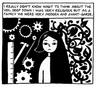
This weeks readings brought lots of interesting ideas and thoughts to the table. I started with Tale of One Bad Rat. It had this kind of (I don't know If I'm using the wrong terminology) "stock" marvel-dc kind of drawing visual style? I'm not equipped with the right vocabulary, but I suppose upon seeing the very first page I was already hesitant if I would enjoy the comic due to its immediate visual reference I was making in my head. However, despite this I decided to keep on reading, and I'm very glad I did! I was expecting it to be one of my 3 options I skim through only a little bit but the intriguing story pulled me towards the end of Book 1. I always enjoy magical realism and when there's a historical context to the narrative its a cherry on top! Language was obviously the biggest mystery of the comic hahaha I found myself often ending up trying to speak the words in the accent in my head which felt like a really unique interactive trait that the comic has. 

Coming after was Asterios Polyp. My favorite aspect of books like this one, is the ability to tie the visual composition and the conceptual contexts (language/words/story) into such an intricate interdependent web where one really couldn't do without the other. Visual information exists through metaphor and allegory in addition to its primary function to help dictate and visualize the story. Breaking the boundaries of medium, color and form also helped reveal to the reader- despite Polyp's rigor, discipline and structure, an insight into the chaos and mayhem that often plagues his mind. The narrative being mostly a character study, did a really good job at acquainting you with the kinds of Asterios Polyp.

Lastly, I had the privilege of reconnecting with a childhood milestone in comic making for me- Bone. I had come upon Bone growing up in India, that from my recollection was one of the only solid "graphic novels" that were being sold in book stores in my town at that time. I remember being excited about having a novel that dictated the entire story through visual assistance- and was even more mind blown to enter the fantastical and mystical realms of Smiths worlds. I was obsessed, going on to research on how he made them, how he started with comic strips in the paper- a character he constructed at the age of 7! Beautiful memories of how impactful this comic was to my love of arts and expression. As I made myself more aware of the path to Bone, its like I began understanding how to 'breakdown' the framework of a comic book. Whether it be story, composition, drawing and inking, coloring or even publishing and releasing. I felt like Bone helped open the doors into reflecting on all of the numerous components required for a successful novel. 

Week 10


BUDDHA tezuka


Re-reading the BUDDHA anthology was exhilarating. I had already been fascinated to come upon it at a young age in India, reflecting on the unique narrative of Goutama- an iconic figure through India. Going through the narrative years later, provided an extra set of eyes to experience the graphic novel through. I never noticed the fluidity of motion in the novel- perhaps I felt the effects of it (smooth reading and action packed scenes that don't feel disrupted), but I was able to pull back and reflect on how successful certain scenes were in capturing motion, action and exciting movement without you ever feeling like words and images are being read. I've also always been a fan of black and white imagery- black ink comics/graphic novels that don't use color. With the art of coloring being its own unique art, I feel as though its more often the case to lose visual depth and composition with a poorly colored novel. However, in black and white gradients, the minimalism assists your imagination in fulfilling the sense of depth and space in the composition without provoking a sensory overload. Especially in a narrative like this where there is a lot of movement and motion, drama and emotion, I enjoyed being carried through with simplistic but vivid imagery.


Tuesday, April 14, 2020

Week 8

MARCH

Considering Ethics and Representation as today’s prompt and genre in comics, I was drawn towards the contrast of Stereotype vs Archetype. While there seem to always be “types” woven into the fabric of most media, literature and entertainment, I wonder of the hierarchy between them. Does one diminish the value of the subject of observation? Stereotype implies a kind of superficial observational conclusion, whereas archetype gives supposed insight into an underlying pattern,an original prototype perhaps. However, with my head filled with Jungian ideas of what psychological archetypes construct our state of consciousness, I could not help but see the deeper emblems/archetypes that many of the main characters in March depicted. Ones of non-violence, strength, unity and kindness- elements that I think most humans have the capacity to embody.
Another really interesting aspect was the attention to compositional framing, whether it was landscape, characters or emptiness, many frames had a film-like quality to them. Motion seamlessly carrying you from frame to frame, I felt the artist spent time constructing a strong visual setting and space that the characters really did occupy. As McCloud said, isn’t a film really just like a reeeeeallly slow comic?

Monday, March 2, 2020

Week 7 Reading Response

Maus - Art Spiegelman

For my High School Visual Art Thesis in the International Baccalaureate Program , I had picked Spiegelman's MAUS to write an extensive research paper on. It is approximately 4000 words. I thought of sharing it for this reading response as I feel I have exhausted multiple theories and perspectives I hypothesized and reflected upon in this essay. 

CLICK ON THE LINK BELOW FOR THE ESSAY


https://drive.google.com/drive/folders/1TdZ_dVrC2FtMFVbLBsMyPMXELmBXDnzr?usp=sharing


Here's the research question and conclusion if you want to just get a gist of what the thesis is.


How does Art Spiegelman effectively use the medium of the graphic novel to emphasize the concept of racism in MAUS?

Visually, the comic is the epitome of simplicity, with depth of content. I discovered how he uses very
specific techniques such as closure and minimalism to create the needed diversion from focus on quality to focus on content. However, alongside the multiple techniques Spiegelman uses, his style of abstraction to depict the holocaust through mice, cats and anthropomorphic animals makes the content on the novel and the concept of racism much clearer to the viewer and makes it less harsh. Using the visual icon of a mouse; vermin, to represent the Jewish population, Spiegelman created a visual impact that no other method could have achieved. He created a sense a neutrality for the viewer, rather than repulsion; as would have been the case if the comic was made with humans instead of mice. People are eased with the image of looking at mass rat genocide, rather than being exposed to hundreds of dead human bodies. I looked at other instances in art where vermin had been used as an icon to show discrimination; such as The Eternal Jew film and Banksy’s Rat that prove to the viewer the disgust the visual image of vermin creates. I certainly noticed the strong impact of this visual metaphor. And despite the fact of MAUS being incomplete without Spiegelman’s brilliant minimalistic, black and white style through the comic, the comic would not have delivered the strong impact of making the viewer really understand the entire notion of racism without the visual metaphor of using Cats and mice. The level of importance of both these factors lie very close together making it difficult to distinguish which plays a bigger role, however I concluded that this comic, would have been seen as a “abhorrent” piece of work rather than a respectful, “Pulitzer prize winning” piece of work that created a big change in the way people perceived the Holocaust.

Week 6 Reading Response

Crumb Cartoonist Track

I just re-did this older tiny comic strip concept I had into a style that resembled crumb- or was "crumb inspired." 


Original comic strip


Crumb style remake attempt


I found this Era to be particularly interesting due to my own personal fascinations with moments in cultures and history where there have been shifts in consciousness- whether it be the bicameral mind and the incorporation of language, the revolution of material goods, entertainment and art or the chaos of the human experience (sex, drugs, war). Artists like Jodorowsky were reminded to me, artists like him and Crumb that dared to explore the raw grit of the honest human experience in hard times, in hard places and around hard people- (pun intended). The contrasted ink work also serves well to the concepts of grit, grime and underbellies- as the harsh lines and emphasized strokes give a sense of distortion.


Week 4 Reading Response

Tintin - Hergé


Tintin always struck me as a constantly enticing and exciting narrative that had the ability to keep me stuck to the pages despite re-reading it multiple times. As a young child, I didn't think twice of why these comics had the capacity to keep me so engrossed without effort. Now looking at some of them again; specifically Tintin in Tibet in this case, I was not surprised to notice its unique rationing of visual information, textual/written content and unconventional pictorial references to things such as newspapers, letters and- not to forget the beautiful landscapes! One interesting connection I felt was from an image from the second page-

 .     


reminded me a lot of those "where's Waldo" or "finding something" in a crowded scene children's book illustrations. It felt as though the artist put so much effort into orchestrating such an elaborate moment with so much movement, cause and effect, and hidden detail that it's almost as if he wants the reader to navigate the panel with the curiosity of a child to find all the tiny details drawn into the scene.

Being a young child growing up in India while I read this book for the first time, I was really amused at the representation of the country/city (New Delhi) in the story. There's a comical narrative overlaid onto a factual and historical image of the location which creates a really intriguing contrast between comedy and different cultures. 

Sunday, January 26, 2020

WEEK 2 READING RESPONSE

Calvin and Hobbes Collection by Bill Watterson


Having read Calvin and Hobbes from a very young age I was excited to reconnect with long forgotten stories I would flip through in my school library. I was always intrigued by Watterson's ability to capture elements of childhood and adulthood by merging the boundaries between them. His commentary on the subjective nature of reality through the metaphor of Hobbes- the character that we would sometimes see as a full grown tiger and sometimes as a stuffed toy. The ability to visually relay differently perceived reality successfully fascinated me, as I felt naturally carried from different worlds from panel to panel. The relationship that Calvin and Hobbes shared seemed to be so complex that it transcended the idea of a normal fantasy or imaginary friend. Also thinking about the dissection of comics using "Nancy" as a model- something we covered in Week 2, I was look at the panels with a new perspective of visual observation. 

Week 1 Reading Response

Understanding Comics by Scott McCloud


Just a few pages into McCloud's "Understanding Comics," I was intrigued by multiple concepts that served as lenses to see comics through a variety of different perspectives. The analytical approach towards deconstructing comics; as expected from McCloud's background which he mentions of in his TEDx Talk, brings the notions of the psyche and its functioning. All this, to get a better understanding the way we as humans interact with and perceive art and comics. 
The compression of time through elements such as the Gutter and Transitions peaked my interest a lot. It reminded me of this neurological problem I had read of once in the Phantoms in the Brain by V.S. Ramachandran called 'motion blindness' or Akinetopsia, where victims are disabled from seeing fluid motion and instead see rigid frames a few varying seconds after each other. When paying attention to how time is perceived in the white space between comic panels we are able to get insight into our brain's functioning of understanding information that is being relayed to it. McCloud smoothly carries on this kind of inquisitive mind wandering into the concept of icons which commented on our neurological wiring- our inescapable tendency to recognize  and see ourselves in everything. There is an apprehension of our brain- in a way, hallucinating our conscious reality. And how comics use this aspect of the human psyche to create visuals that allow readers to "be" and not just "see." Playing on the philosophy of extensions of identity, we are able to interact with comics and see reflections of selves in the form of archetypes. 

Week 14

Perry Bible Fellowship Almanak and Megg and Mogg Gurewitch brings a collection of strips that off hand reminded me a lot of the Cyan...